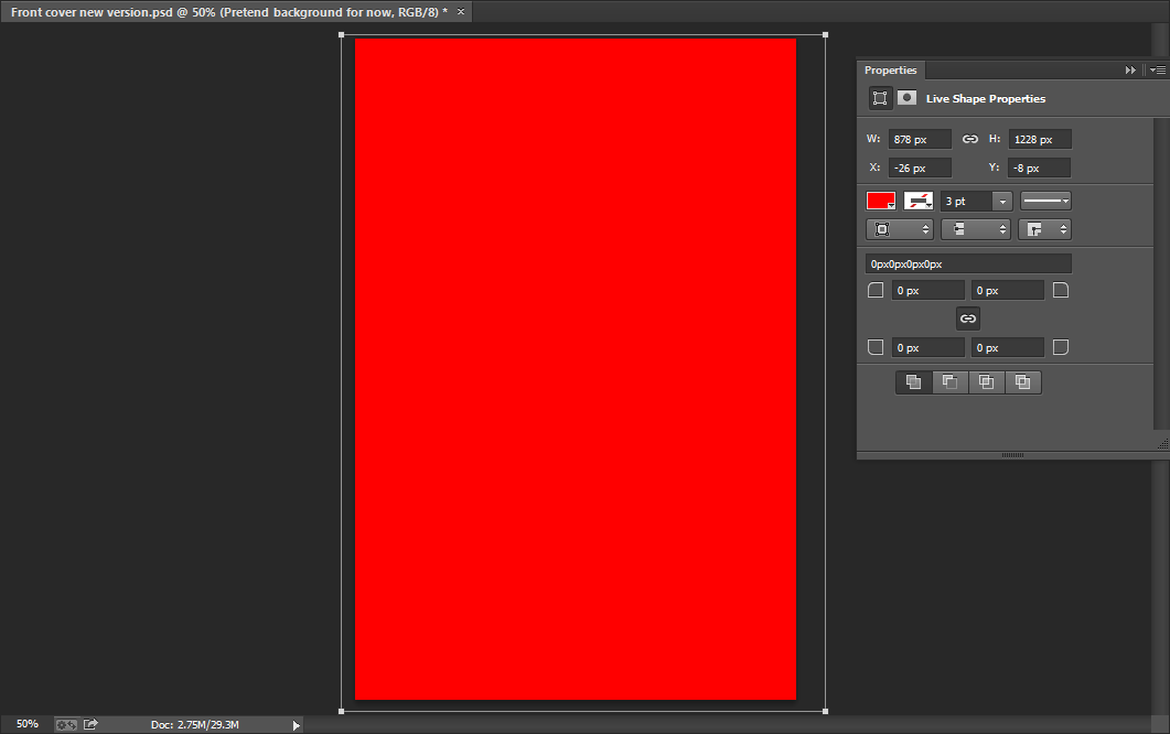
I began with a plain red background when I started to create my music magazine front cover.
After this, I decided to make a sticker to go at the top of the page on the right hand side of the banner. I went on the internet and found this image that you can see on the left and cut it out using the magnetic lasso tool.
I then placed it in the top right hand corner and I then changed the colour of the sticker from red to black. As you can see more clearly in the image below, I did this by going to image - adjustments - replace colour.
Next, I decided to change the background colour of my front page as I thought the previous red that I used was a little too bright and this colour looks more professional. I simply did this by using the rectangle tool to change the background colour.
 I chose a font from DaFont for the masthead for my contents page and as you can see I chose the font 'Bison'. I chose this as I thought it suited my genre well and it went well with the actual name 'Eccentric'.
Once writing the masthead I decided that it would look good if I added a drop shadow. I kept the opacity at 100% and underneath you can see more clearly as to how I created the drop shadow.
 I then added the text in the sticker which reads 'My Life, Special Offer!' Furthermore, I wrote 'Imagine Dragons','Arctic Monkeys' and 'Harry Gold' in the top banner and to these words I added a slight outer glow to enable them to stand out. The opacity of the outer glow I used is 75%, the range is 50%, the spread is 5% and the size is 5%, as you can see below. After this I added another yellow banner but this time at the bottom of the front page and a bit bigger.
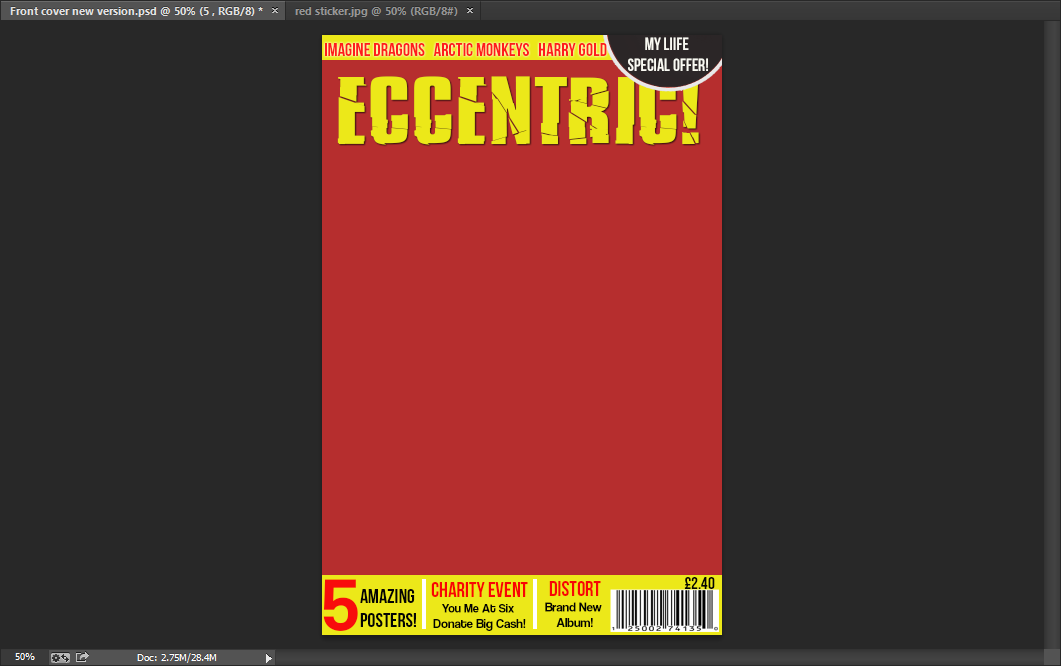
After this, I added text in the bottom banner using the horizontal type tool. The fonts I used were Bebas Neue and Coolvetica. As you can see I simply divided the text up with small white rectangles which I made with the rectangle tool. Lastly, I then found an image of a bar-code and put that in the right hand corner after adjusting the size.
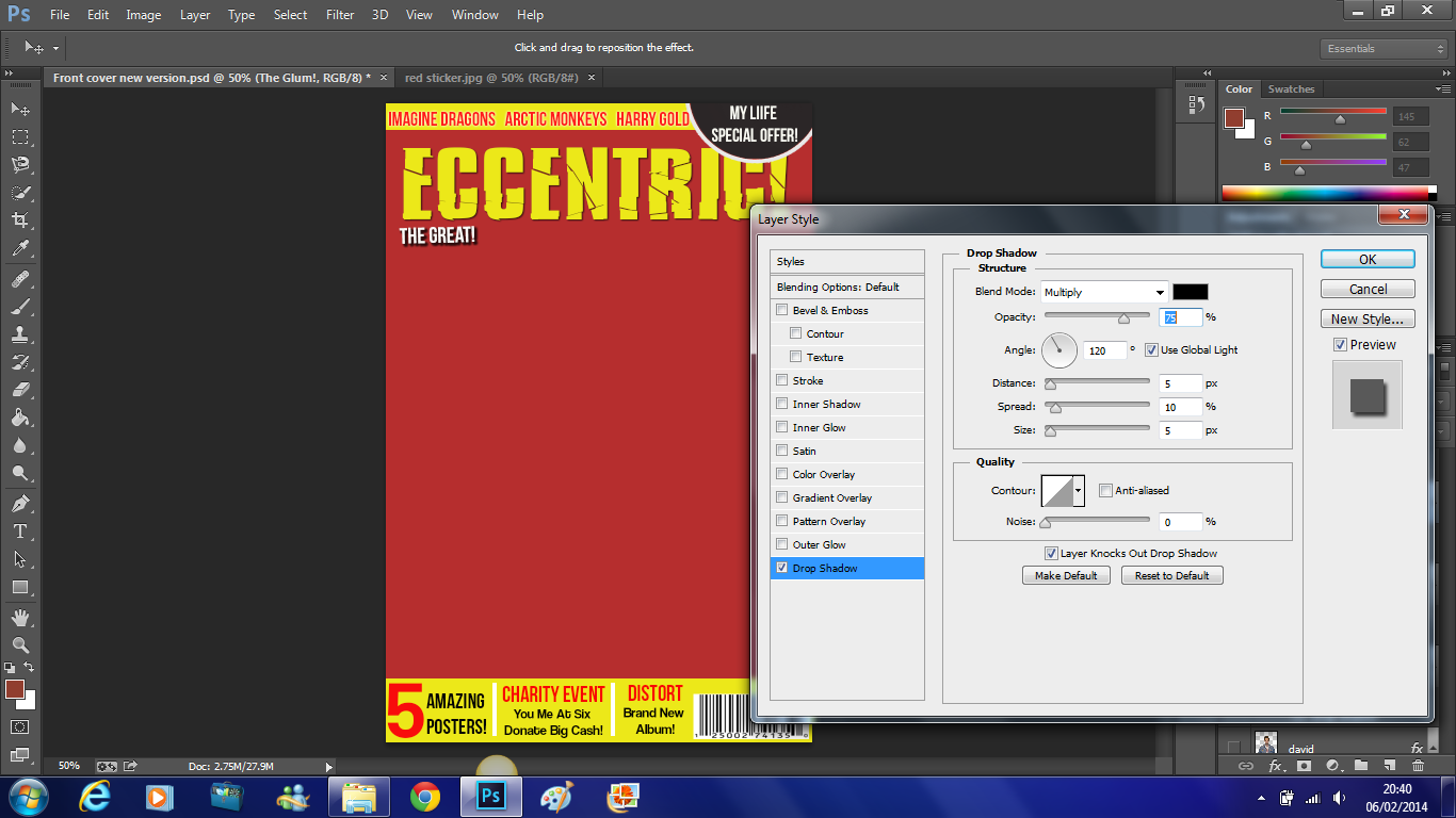
As you can see,of the first of the trio which is 'The Great!' I added a drop shadow to and below you can see more clearly that the opacity is 75%, the distance is 5%, the spread is 10%, the size is 5% and the angle used is 120 degrees.
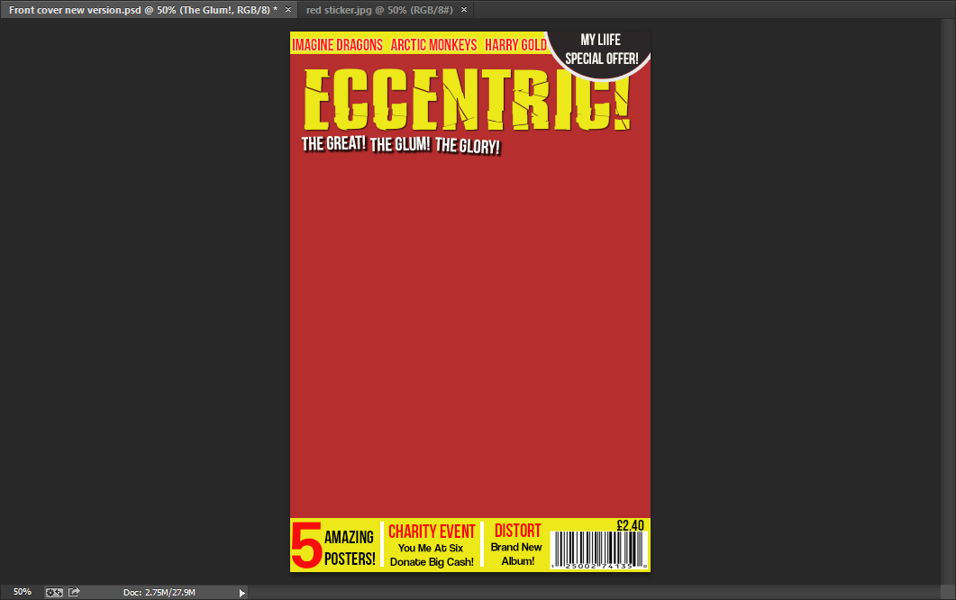 Here is the completed alliteration of the 'The Great!The Glum! The Glory!'. This trio has exactly the same drop shadow as 'The Great!' which is shown above.
Here is my first main cover line - 'David Field Exclusive Interview'. This is written in Bebas Neue font in yellow.
I then added individual black rectangles using the rectangle tool. I placed these underneath the text as this enabled it to stand out more and this is very important as this is the most important cover line on the front page.
I then did this for all of the other cover lines on the front page. Except here the text is in black instead of yellow. Moreover, the main heading which in this case is 'Pearl Jam' has a yellow rectangle fitted around it and the text underneath has white rectangles fitted around them which are all created individually.
Next I focused on my main image. I began by cutting him out using the magnetic lasso tool. I dragged him onto my front page and altered the size of him. I placed him behind the cover lines but in front of the masthead, as this is a common feature used by professional music magazines.
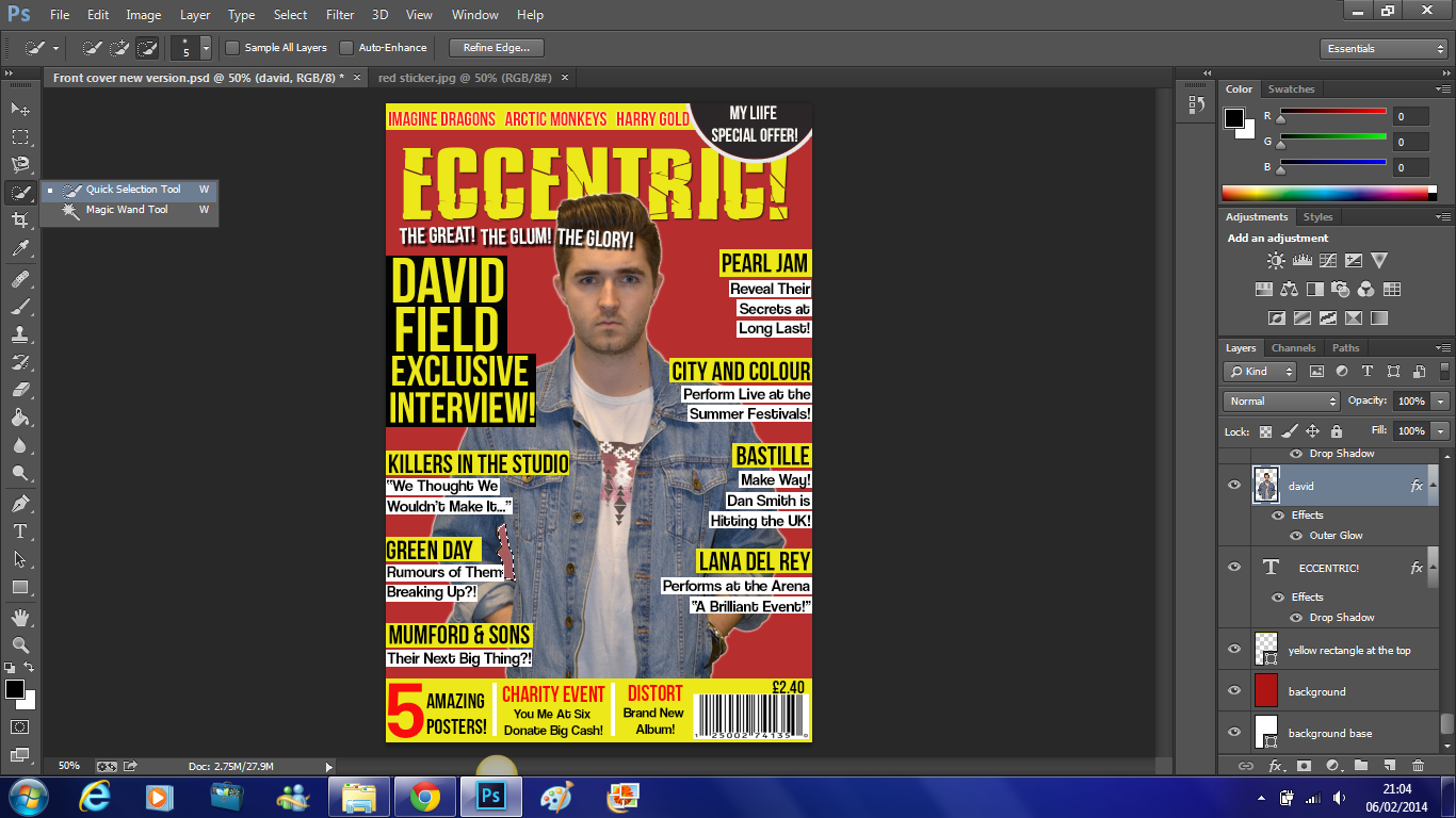
After this I noticed that the colour underneath his arm was not the same as the background so I selected the area using the quick selection tool and as I did earlier to change the colour of the sticker I went to image - adjustments - replace colour. Which you can see below.
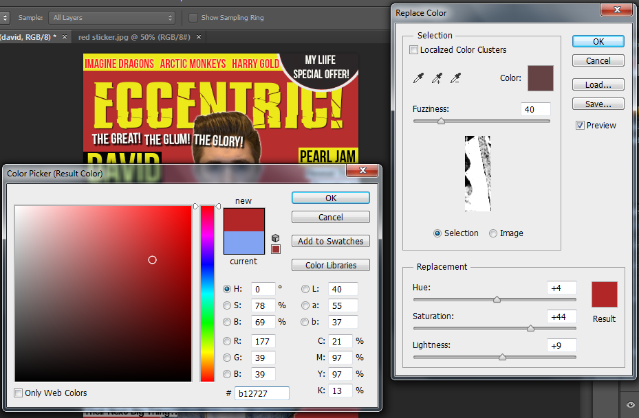 Here you can see the exact colour that I used to match the colour to the background.
I noticed that David had slight red eye, so I simply used the red eye tool and clicked on either eye to correct this.
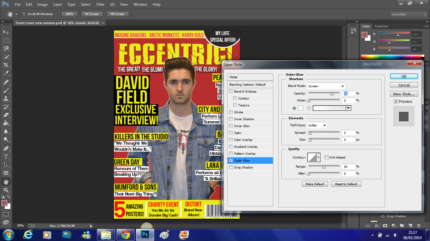 Lastly, I wanted to add a slight outer glow to David to make him stand out more and become more eye catching to the reader. Here you can see that the opacity of the outer glow is 75%, the spread is 5%, the size of the outer glow is also 5% and the range used is 50%.
This is the finished front page which you can see on the right.


No comments:
Post a Comment