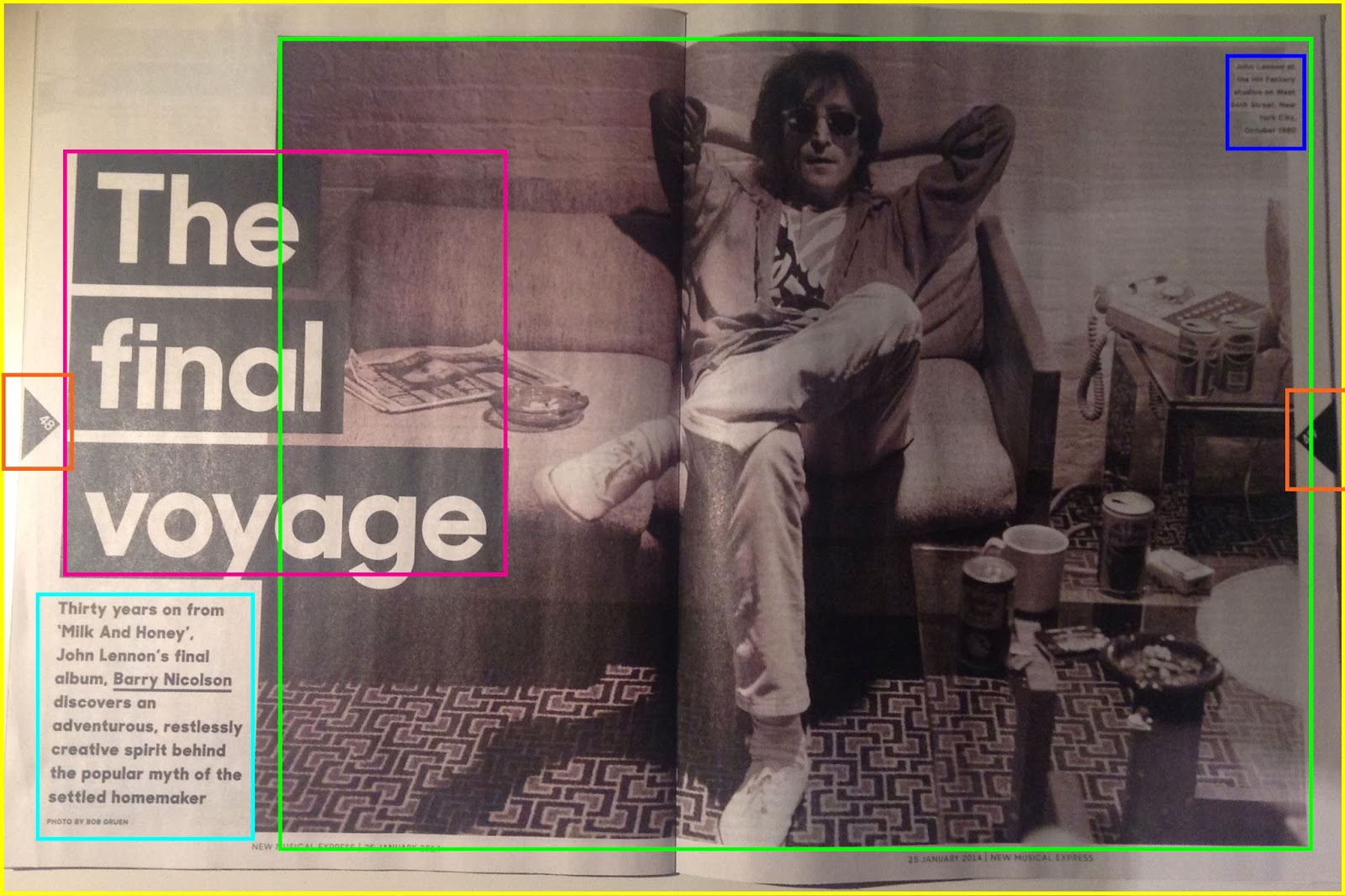
On the first page of the of the double page spread there is only one image and that is of John Lennon when he was younger; this is shown through the de-saturated image which makes it look much older and from that time. Furthermore, in the top right hand corner of the image which is highlighted by the blue rectangle is a caption informing us about the image. This is also carried onto the second page of the double page spread which is also highlighted by a blue rectangle. This helps keep the double page spreads consistent.
The design elements that are present are, firstly, the triangles that are used to show the page numbers which are highlighted by orange rectangles and this is also on the other double page spread. Also another design element is the black rectangles that are used to highlight 'The final voyage' on the first double page spread and a quote on the second page. On the second double page spread yellow rectangles are used as well. These simple elements bring much more substance to the page and it just makes the double page spread more interesting.
On the second double page spread several more images are used which are highlighted by a green rectangle and there are 4 in total. These images help to inform the reader more about the article and give them a more visual experience, rather than just boring text. Moreover, the image nearest to the right hand side is at an obscure angle, so although the image is small our attention is still drawn to it as it is different from what we usually see in a music magazine.
There are six columns that are used on this double page spread and they are all evenly spaced apart. There is a lot of text on the second half of the double page spread and I think this is to make up for the lack of text that is presented on the first page of the double page spread which is highlighted by a turquoise rectangle. An interesting element of the text is shown in the right hand corner where the text is highlighted yellow. This works well as, firstly, it draws your attention to it but also it stays within the house style as the main colours that are being used are white, black and yellow.

Lastly, a common design element is used at the beginning of the text which is the drop caps. This is bold, in sans-serif font and it is black. This just adds something extra to the text and simply makes it more appealing to the eye.

No comments:
Post a Comment