Tuesday, 28 January 2014

'NME' Music Magazine - Third Front Page, Contents Page and Double Page Spread Comparison


In this comparison of an issue from the 'NME' music magazine the masthead is carried from both the front cover to the contents page. Straight away you can see that a house style is present. 

The main image on the front cover is highlighted by a blue rectangle and it is of John Lennon. This image is carried over to the contents page and the double page spread, these are also highlighted. However these two images are de-saturated as they are images of John Lennon in the past a much longer time ago. Where as the image on the front cover is a more recent photograph. 

The main aspect that links the front page and the double page spread is the text that is highlighted by a red rectangle as both texts mention that it has been thirty years since John Lennon's last album 'Milk and Honey'. 

Lastly, the design elements that are used are mainly just the red and black rectangles that are used to help highlight certain parts of the text that they wish the reader to pay closer attention to such as 'Lennon' which is on the front page and is kept very consistent with the actual masthead design - 'NME'. 'The Final Voyage' which is written on the double page spread and is highlighted by black rectangles. Furthermore, these design elements are also used on the contents page which you can see are highlighted with orange and pink rectangles. This simply maintains the house style and brings new dimensions to the magazine, making it more interesting and heightening the chances of their magazine being bought over any other music magazine in the shop.

'Kerrang' Music Magazine - Second Front Page, Contents Page and Double Page Spread Comparison


In this second comparison of an issue out of the 'Kerrang' music magazine the house style is maintained throughout the front cover, the contents page and the double page spread through the use of maintaining the colour scheme which is red, yellow, black and white. 

Furthermore, the strongest connection between the contents page and the double page spread is the use of the same image of the 'Of Mice & Men' band. A smaller image of this with the page number which informs the reader as to where the double page spread article in the magazine is, is in the left hand corner of the contents page which is highlighted by a green rectangle. As you can see a much bigger version of this shown on the double page spread. 

The main design element that is used that links the contents page and the double page spread is the use of a sticker in the right hand corner of the contents page and the left hand corner of the double page spread. Both of these are black half circles, with white writing on it with red rectangles and the same fonts are used on both of these design elements.

Lastly, the fonts that are used across the front cover, contents page and double page spread are the same in most cases. Again this is to help maintain the house style which is very important to help the reader gain familiarity with this particular music magazine. 

'Q' Music Magazine - First Front Page, Contents Page and Double Page Spread Comparison


This is a comparison of an issue out of the 'Q' music magazine. The masthead carries from both the front cover to the contents page. However, shown by the yellow rectangles the 'Q' on the front cover is white with a red background, whereas, on the contents pages the 'Q' is red with a black background. Despite the change in colour scheme it still shows consistency and maintains the house style across these pages. 

This particular magazine has two contents pages which is not that common, but each page has many images on it. The first page of the contents page has 6 images on it and the second page has 4 images on it. 
The main image on the front cover is of 'The Smiths' and this image has been de-saturated. Also an image of the Smiths is also shown on the contents page and the double page spread which is highlighted by a pink rectangle; both images on the contents page and the double page spread are of the the whole band so variation of the image is used effectively. Also these images use vibrant colours which makes them more appealing to the reader.

On the front cover and the double page spread the use of pink has been used this works well as it is used just to help the reader to associate this colour with the band 'The Smiths'. Furthermore, this colour scheme is used on every double page spread in the magazine to do with 'The Smiths'. However, they do not use this colour scheme in any other issue in the magazine and it is a unique feature for this issue. 

Moreover, other elements help to link the front cover, contents page and double page spread. This includes elements such as the image of Lily Allen on the front page which is carried over to a bigger image on the contents page, this is shown via the highlighted orange rectangles. Lastly, the stickers that are highlighted by purple rectangles are present and this helps connect the contents page and the double page spread as similar design elements are used on both pages.


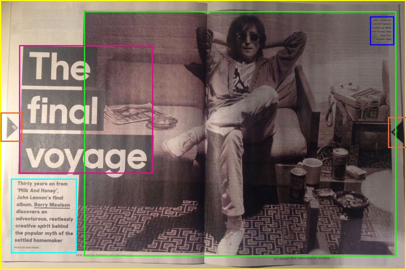
'NME' Music Magazine - Third Double Page Spread Analysis

My third double page spread analysis is an article on John Lennon from the 'NME' magazine. 
On the first page of the of the double page spread there is only one image and that is of John Lennon when he was younger; this is shown through the de-saturated image which makes it look much older and from that time. Furthermore, in the top right hand corner of the image which is highlighted by the blue rectangle is a caption informing us about the image. This is also carried onto the second page of the double page spread which is also highlighted by a blue rectangle. This helps keep the double page spreads consistent. 

The design elements that are present are, firstly, the triangles that are used to show the page numbers which are highlighted by orange rectangles and this is also on the other double page spread. Also another design element is the black rectangles that are used to highlight 'The final voyage' on the first double page spread and a quote on the second page. On the second double page spread yellow rectangles are used as well. These simple elements bring much more substance to the page and it just makes the double page spread more interesting. 

On the second double page spread several more images are used which are highlighted by a green rectangle and there are 4 in total. These images help to inform the reader more about the article and give them a more visual experience, rather than just boring text. Moreover, the image nearest to the right hand side is at an obscure angle, so although the image is small our attention is still drawn to it as it is different from what we usually see in a music magazine.

There are six columns that are used on this double page spread and they are all evenly spaced apart. There is a lot of text on the second half of the double page spread and I think this is to make up for the lack of text that is presented on the first page of the double page spread which is highlighted by a turquoise rectangle. An interesting element of the text is shown in the right hand corner where the text is highlighted yellow. This works well as, firstly, it draws your attention to it but also it stays within the house style as the main colours that are being used are white, black and yellow. 


Lastly, a common design element is used at the beginning of the text which is the drop caps. This is bold, in sans-serif font and it is black. This just adds something extra to the text and simply makes it more appealing to the eye.

'Kerrang' Music Magazine - Second Double Page Spread Analysis

My second double page spread analysis is on an Of Mice & Men article. 
There are several images on this double page spread - 9 in total. The main image is of the band in a staged photograph outside on some stairs; I think suits their characters and goes with the genre as well as it is something quite different. Again it is the typical group photograph with the main lead in the foreground and the other members of the band in the background. This image takes up most of the first page with the text written around it and it slightly laps over onto the next page. The other images are simply placed around the double page spread helping the reader to engage more with the article that has been written. 

There are several design elements that are used on this double page spread, they are all fairly simple such as the sticker that is in the left top hand corner that is highlighted with the red rectangle. This works really well as firstly it it stays within in the colour scheme through the use of red, white and black. Also through the use of this design element, the chosen colours and fonts, it makes the page more appealing to it's audience. Furthermore, other design elements that are used are the yellow rectangles that help to highlight particular parts of the text. 

Many coloumns are used on this double page spread. On the first side they use 4 columns, the first column being much bigger than the other 3. On the second side of the double page spread 5 columns are used. It is not usual for this many columns to be used on one double page spread. However, it does make everything look very organised and it compliments the number of images that are used.

There is the page number and the brand identity feature used on both sides of the double page spread - on the first page it is in the bottom left hand corner and on the second page it is in the bottom right hand corner. This is highly common for a music magazine to have. Moreover, within magazines that are published monthly rather than weekly it is quite usual to see an issue number to be published there as well to increase the identity aspect of the magazine.


'Q' Music Magazine - First Double Page Spread Analysis

My first double page spread analysis is of the band - The Smiths. On the first page of the double page spread you notice the enlarged image of the band. This is a typical photograph of a band with the main lead in in the foreground, as he is seen to be the most important, and the others who are in background; three of them are looking directly at the camera and the fourth person is looking to his right. The image does cover the whole entire double page spread but you only notice half of it which is highlighted by the pink rectangle as the other half is covered in text informing us about them.

In the top left hand corner of the image a design element of a simple pink rectangle is used which highlights a caption that introduces all of the people in the band, what year it is and where they are. This keeps to the house style of the double page spread and as you can see this design element is carried over onto the second page of the double page spread which you can see highlighted in blue in the right top hand corner of the image. 

Furthermore, the image on the second page also takes up the whole double page spread but again it is partly covered by the text that is written on it. This is the same as the first image used. However, this image is in black and white which connotes that the band is old, which they are, therefore helping the reader to link this connection more easily. Also it is the only image on this double page spread but it still works very well as it is of a live performance which gives a greater impact on the page as a whole. 
Another design element that is used is another simple blue rectangle in the top right hand corner of the image  and this also helps maintain the house style throughout the article. A smaller and more refined version of what is shown on the first double page spread is used which is highlighted by a green rectangle; also the same font and colour scheme of the font is used in both blue rectangles.
Moreover, the title on the second double page spread is 'The Holy Alliance'. This is written in large, bold, sans -serif text and it is underlined with a think pink line. Also this is carried through to the beginning of the text which starts with 'In the'. 

Lastly, the 'Q' magazine uses different layouts for different articles. As you can see shown on the first page of the double page spread the text is presented in a block of text and no columns are present at all. Where as in this double page spread they use three columns for their text which is highlighted by the turquoise rectangle.

Front Page Construction


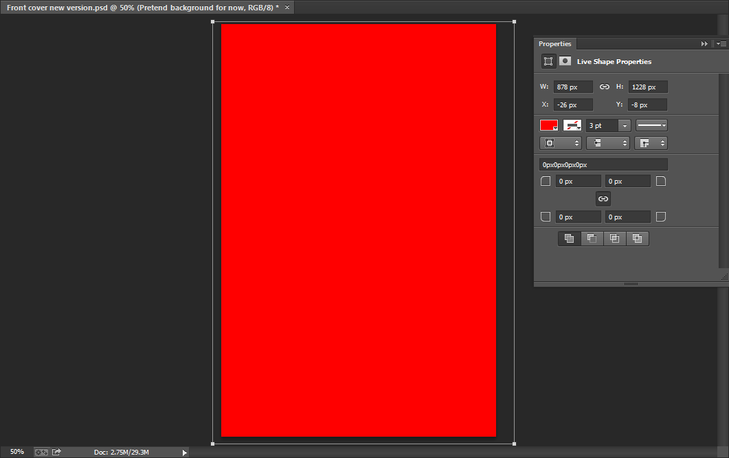
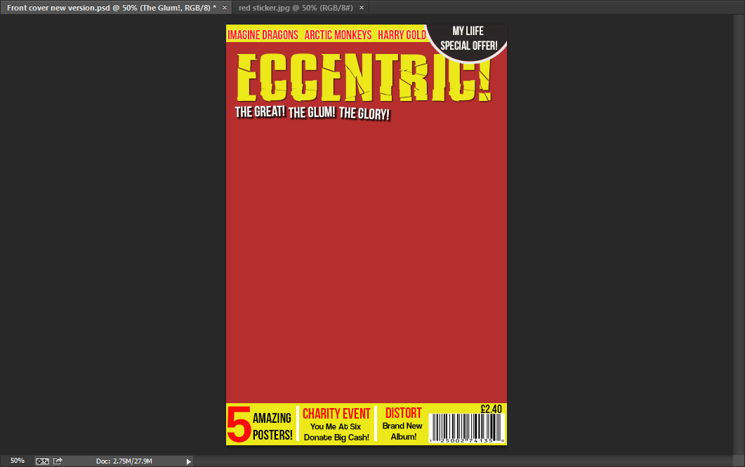
I began with a plain red background when I started to create my music magazine front cover.
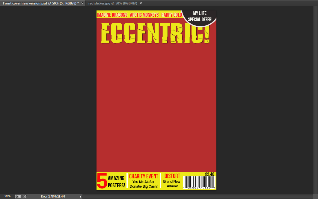
As you can see I then added a thin yellow banner at the top of the page using the rectangle tool.

 After this, I decided to make a sticker to go at the top of the page on the right hand side of the banner. I went on the internet and found this image that you can see on the left and cut it out using the magnetic lasso tool.
I then placed it in the top right hand corner and I then changed the colour of the sticker from red to black. As you can see more clearly in the image below, I did this by going to image - adjustments - replace colour.
Here are the exact figures of the colour that I changed the red sticker to. Including the hue which is -7, the saturation which is -73 and the lightness which is -49.


 Next, I decided to change the background colour of my front page as I thought the previous red that I used was a little too bright and this colour looks more professional. I simply did this by using the rectangle tool to change the background colour.
I chose a font from DaFont for the masthead for my contents page and as you can see I chose the font 'Bison'. I chose this as I thought it suited my genre well and it went well with the actual name 'Eccentric'.

Once writing the masthead I decided that it would look good if I added a drop shadow. I kept the opacity at 100% and underneath you can see more clearly as to how I created the drop shadow.


I then added the text in the sticker which reads 'My Life, Special Offer!' Furthermore, I wrote 'Imagine Dragons','Arctic Monkeys' and 'Harry Gold' in the top banner and to these words I added a slight outer glow to enable them to stand out. The opacity of the outer glow I used is 75%, the range is 50%, the spread is 5% and the size is 5%, as you can see below. After this I added another yellow banner but this time at the bottom of the front page and a bit bigger.


After this, I added text in the bottom banner using the horizontal type tool. The fonts I used were Bebas Neue and Coolvetica. As you can see I simply divided the text up with small white rectangles which I made with the rectangle tool. Lastly, I then found an image of a bar-code and put that in the right hand corner after adjusting the size.


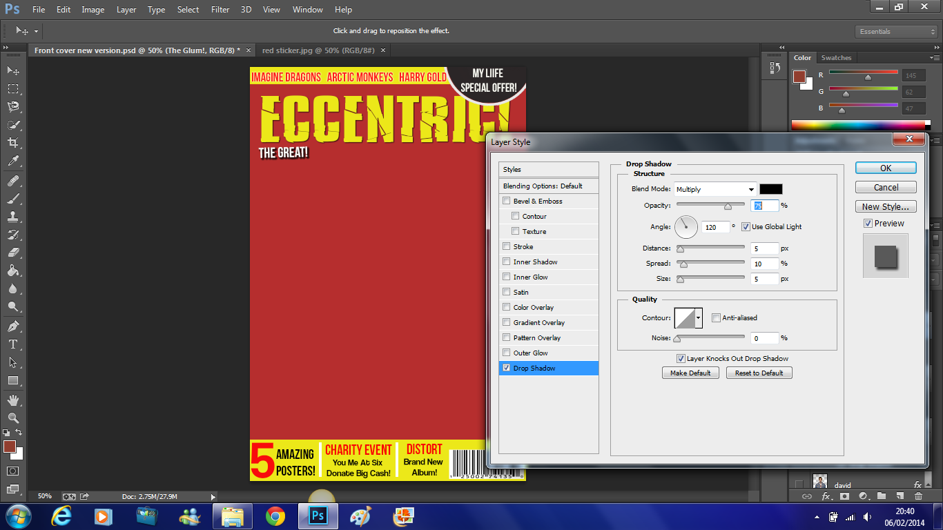
As you can see,of the first of the trio which is 'The Great!' I added a drop shadow to and below you can see more clearly that the opacity is 75%, the distance is 5%, the spread is 10%, the size is 5% and the angle used is 120 degrees. 

 Here is the completed alliteration of the 'The Great!The Glum! The Glory!'. This trio has exactly the same drop shadow as 'The Great!' which is shown above.


 Here is my first main cover line - 'David Field Exclusive Interview'. This is written in Bebas Neue font in yellow.
 I then added individual black rectangles using the rectangle tool. I placed these underneath the text as this enabled it to stand out more and this is very important as this is the most important cover line on the front page.

 I then did this for all of the other cover lines on the front page. Except here the text is in black instead of yellow. Moreover, the main heading which in this case is 'Pearl Jam' has a yellow rectangle fitted around it and the text underneath has white rectangles fitted around them which are all created individually.
 Here on the right are the completed cover lines on the front cover.

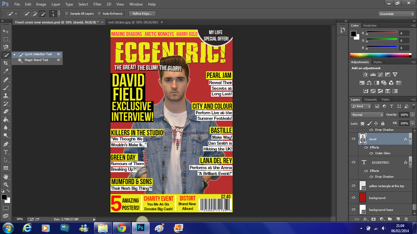
 Next I focused on my main image. I began by cutting him out using the magnetic lasso tool. I dragged him onto my front page and altered the size of him. I placed him behind the cover lines but in front of the masthead, as this is a common feature used by professional music magazines.


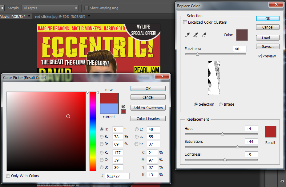
After this I noticed that the colour underneath his arm was not the same as the background so I selected the area using the quick selection tool and as I did earlier to change the colour of the sticker I went to image - adjustments - replace colour. Which you can see below.


 Here you can see the exact colour that I used to match the colour to the background.


I noticed that David had slight red eye, so I simply used the red eye tool and clicked on either eye to correct this.

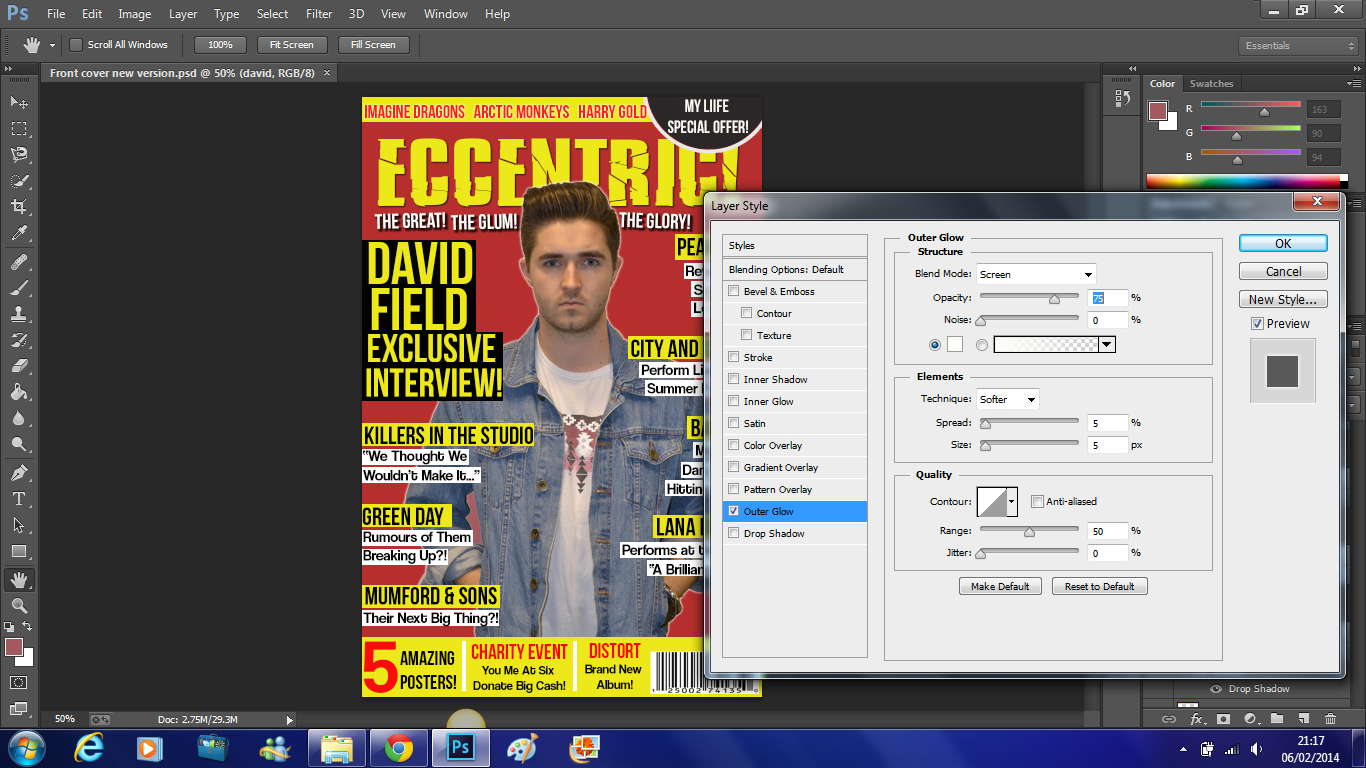
 Lastly, I wanted to add a slight outer glow to David to make him stand out more and become more eye catching to the reader. Here you can see that the opacity of the outer glow is 75%, the spread is 5%, the size of the outer glow is also 5% and the range used is 50%.


 This is the finished front page which you can see on the right.


Final Front Page


Contents Page - First Draft


'NME' Music Magazine - Third Contents Page Analysis


Saturday, 25 January 2014

List of Features of Front Page and Contents Page

Front Page:
  • You Me At Six 
  • Arctic Monkeys 
  • Harry Gold
  • My Life Special Offer
  • The Great! The Glum! The Glory!
  • David Field Exclusive Interview
  • Killers in the Studio - "We thought we wouldn't make it..."
  • Green Day - Rumours of them breaking up?!
  • Pearl Jam - Reveal their secrets at long last!
  • City and Colour - Perform live at summer festivals!
  • Bastille -Make way! Dan Smith is hitting the UK!
  • Lana Del Rey - Performs at the arena "A brilliant event!"
  • 6 Amazing Posters!
  • Charity 'Case' Imagine Dragons donate big cash!
  • Distort - Brand new album!
  • Price - £2.40
Contents Page:

News
  • Killers in the studio - "We thought we would never complete it..."
  • Pearl Jam - Reveal their secrets at long last!
  • Arctic Monkeys - Too many fans become overwhelming?
  • Introducing: Harry Gold - Was it success or just coincidence?
Feedback
  • Receive your letters - You can now receive your letters from your chosen artists... you're welcome!
Features
  • Mumford & Sons - What's their next big thing?!
  • Green Day - Rumour of them breaking up?... Time to grab the tissues. Tragic!
  • Charity Event - You Me At Six donate a huge sum of money. God bless them!
  • City Riots for Beck? - We establish the most WTF moments of 2013!
Exclusive Interview
  • David Field - We hear David's story of his rise to fame.
Lives
  • Bastille - Make way! Dan Smith is hitting the UK!
  • You Me At Six - The Weybridge wizards head down under. Lucky them!
  • Lana Del Rey - Performs live for just one night at the arena. "Such a brilliant event."
Gig Guide
  • City and Colour - Performing live at the 2014 summer festival. Brand new. Unmissable!
  • Buy tickets now!
  • Go to this website and buy these unmissable tickets: www.eccentricsummerfestival.com
Albums
  • My Life - Charlotte Golledge releases her 4th album - has the fame changed her completely?!
  • Distort - It's finally out! David releases his brand new album!
  • Bad Blood - Is it their best album so far? You decide!
  • Fall Out Boy - Bringing it hard...
Eccentric Treats
  • Posters - Included inside are 5 free amazing posters just for your benefit!

Possible Locations


To help me to come up with some ideas as to what locations I can use for my print production, I decided to make this Animoto of photographs taken from previous celebrity photo shoots.

Mood Board


I made an online mood board to represent my ideas and what I think of when I think about the genre - indie/alternative. In this it includes artists that are within the genre, accessories and jewelry that fits in with the genre, obviously the iTunes logo which represents the music and the downloading of music and also the different styles which is associated with this genre.

Double Page Spread - First Draft

This week David Field releases his first album, ’Distorted’,  after trial, error and perseverance, David has worked his way to the top, even having achieved his very popular song ‘A day without you’ to reach number 1 on the charts! 

Congratulations David on the upcoming release of your first album! How do you feel right now?
“Hey, yeah, thanks very much!” I feel amazing, I mean it was a long hard slog at times but it’s great now that I’ve gotten through this recording process. It took me, on and off, about a year. It was a long journey to get there and I worked very hard on it with my producer Ben Hammond, who has been a big inspiration to me.

What would you say has been the highlight of your journey so far?
Well obviously the support and the increasing number of fans have been brilliant and just the whole experience really; also to be able to sing and produce music that I wish to inspire my fans with in the future, as this is dream of mine.

Why did you choose the album name ‘Distorted’?
I chose the album name ‘Distorted’ because I am often perceived as quite a cold hearted person and have a reputation for not caring, but I wanted to reveal that this is not so and I do have a heart, therefore I decided to base my new album around the theme of romance and love to distort this view .

Who supported you whilst making your album?
It was a big team effort, mainly my family and my producer, Ben, as they were ever-present during the albums construction. They provided a great heap of support both with the music side of things as well as emotionally.

What are you most looking forward to in 2014?
Obviously, the release my album, I can’t wait as I have worked so hard on it and waited for such a long time and the day for it to be released is getting closer and closer, and I am very apprehensive about it.

Wow, you seem very passionate about your work especially for someone so new to the industry.
Oh thank you so much, I find it very rewarding when I hear things like that. My fans mean a lot to me and I want this to be noticed through my passion.

“My Fans mean a lot to me and I want this to be noticed through my passion.”

You mentioned your fans, are you going to be arranging a tour for them?
It’s been on mind, finances are restricted right now, so we will have to wait to see how the album is received. But I promise I will arrange one soon (winks at me).

So when you fulfil your promise what countries are you planning on visiting?
Certainly the UK as that is where my main fan base is at the moment. I am also hoping to travel a bit to places such as the USA and Australia, as I have always wanted to experience different cultures.

How are you planning on coping with the fame?
I just want stick with my friends and family, with them I will always be 100% grounded. I feel that as long as I have them by my side they help me to remember that I am just an ordinary guy who is living his dream.

Thank you so much for the interview, we wish you all the best for the future.
Thank you it was lovely talking to you.

Audience Expectations

Audience expectations are what the audience expects to see when they look at a magazine and these expectations are different for each specific magazine.

Pop magazines, for example, are completely different from Indie and R&B magazines. Here the audience expects bright vibrant colours, clean cut text and high key lighting to make the artist or model stand out and come alive.

In this magazine we can see that there are very vibrant colours, such as bright pinks and purples and some yellow which are all feminine colours, so this suggests that this magazines target audience is mainly females and pop is associated with having a mainly female target audience about 16- 25, hence they use popular female colours. Furthermore, as you can see Cheryl Cole who is the artist that is being used on the front cover has been photo-shopped to stand out more and as I have mentioned earlier this is due to the high key lighting that is being used. There are also many cover lines and page furniture used to attract the readers attention and make it stand out.


In 'Kerrang' an indie/ alternative rock magazine, the audience expectation would be for bold text, dark clothing on models and colours that stand out such as red, yellow and black, the magazine is expected to be loud, give off a bit of attitude and stress their individuality. You can tell that the artists that have been chosen to model have an interesting personality due to their facial expressions.

The design of the masthead 'Kerrang' sets a tone which makes the audience feel on edge and this will result in the target audience being drawn in by this magazine further. Rock magazines tend to have a negative connotation that shows aggression. However, they tend to contrast completely with what people associate to be good and set bad a role model for the younger generations, therefore their target audience ranges to a much higher age, usually about mid 30's.  


Target Audience

 I went onto the UK tribes website to help me with my research on finding out about who my target audience are. I was able to look at all the different segments and I found that my genre, and my target audience links under the segment 'Scenester' this is the research I found on Urban Tribes from the UK tribes website.

Indie Scenesters are dedicated to finding the newest music, exploring all avenues to get there – online, print, record shops, club nights and word of mouth. Staying ahead of the curve is a must, but it’s borne out of a genuine love for music – and this is what separates them from those more fickle dabblers and dilettantes, the Hipsters. For Indie Scenesters, there’s nothing better than discovering new artists and spreading the love.

Guitar music has seen its cool usurped by the rise in electronic-synth based music in recent years, and Indie Scenesters have broadened their musical tastes as a result. It’s no longer just about indie rock bands like Vampire Weekend – Indie Scenesters have embraced experimental, genre-blending artists like Four Tet. Yet, the Indie Scenester approach remains the same – it’s about championing independent artists rather than a specific genre, especially before the masses get in on the act.

Potentially having their own music blogs and club nights (or at least dreaming of it), Indie Scenesters are more concerned with building up their vinyl collections than conspicuous consumerism. The sounds of the moment are ever changing, but currently include Youth Lagoon, Beach House, Animal Collective, Kendrick Lamar and John Talabot, as well as old favourites like Caribou and Thom Yorke.

Boys and girls are rocking similar looks – skinny jeans, vintage and Converse/Vans. Their high street staples focus around the functional and unisex – Uniqlo, Cheap Mondays and American Apparel.


My Target Audience Video


This is my target audience video, it shows who my target audience are, how much time they spend on social networking sites and their fashion trend as you find out as to what shops that they like to shop in. 

My target audience ranges from 16-25 year old males and females. I am going to target a wider audience by producing articles likely to have a broader interest. Furthermore, the audience will have a passion for films, music and should be technology able. Also they will have a fair amount of disposable income to be able to spend on the magazines and they will then go on to buy external items that have been advertised and are related to the magazine content. 


In the Pixton below, it shows who my target audience is and it informs you of how old some of my target audience will be, where they like to shop and how they spend there time, for example, social networking sites.


This is my Target Audience Questionnaire in the form of a Voki. 

To help me with my target audience research for my music magazine I decided to make a questionnaire to help me find out more about the interests and like of my target audience. Using this questionnaire, I have interviewed and recorded some people from my target audience who are of different ages.


To hep me identify who my target audience is further I decided to interview David who is 21, Harry who is 19 and Charlotte who is 16. I used the questionnaire that I made previously to help me find out their likes, interests, favourite artists, shops, radio stations and so on. Furthermore, this will give me a broader idea of my target audience as they are all different ages, thus, helping me with the creation of my music magazine.


I decided to make a slidely to show the style that people from my target audience like and this includes clothes, shoes and accessories. What they  wear is associated with my genre - indie/alternative, as the fashion sense is based on around that.

Music Genre - Brief History, Iconography and Lists of Artists


Indie rock is a genre of alternative rock that originated in the United Kingdom and the United States in the 1980s. Indie rock is extremely diverse, with sub-genres that include indie pop, jangle pop, C86 and lo-fi, among others. Originally it was used to describe record labels, the term became associated with the music they produced and was initially used interchangeably with alternative rock. As grunge and punk revival bands in the US, and then Brit pop bands in the UK, broke into the mainstream in the 1990s, it came to be used to identify those acts that retained an outsider and underground perspective. In the 2000s, as a result of changes in the music industry and the growing importance of the Internet, a number of indie rock acts began to enjoy commercial success, leading to questions about its meaningfulness as a term.


Alternative rock is a genre of rock music that emerged from the independent music underground of the 1980s and became widely popular by the 1990s. The 'alternative' definition refers to the genre's distinction from mainstream rock music, expressed primarily in a distorted guitar sound,transgressive lyrics and generally a nonchalant, defiant attitude. The term's original meaning was broader, referring to a generation of musicians unified by their collective debt to either the musical style, or simply the independent,D.I.Y  ethos of punk rock, which in the late 1970s laid the groundwork for alternative music. At times, "alternative" has been used as a catch-all description for music from underground  rock artists that receives mainstream recognition, or for any music, whether rock or not, that is seen to be descended from punk rock.

Alternative rock is a broad umbrella term consisting of music that differs greatly in terms of its sound, its social context, and its regional roots. By the end of the 1980s magazines and zines, college radio airplay, and word of mouth had increased the prominence and highlighted the diversity of alternative rock, helping to define a number of distinct styles such as gothic rock, jangle pop, noice pop, C86 and industrial rock.


This is an example of how the genres indie and alternative do work together to create a combined music genre.


In this video that I made there are a few up to date Indie/Alternative artists and bands.

Pricing and Page Number Research


When I make my own music magazine, I have to make sure that the cost of my magazine will be suitable regarding whether it is a monthly or a weekly magazine; also I will have to think about how many pages my magazine is going to have as this will not only help me to decide how much I can charge for magazine but also it will help me to make my contents page and to know how much content I need to include. After doing this research I found out that it is more common that the more pages and the higher the pricing that the magazine has it is usually, but not always, going to be a monthly magazine. Furthermore, this research has helped me a lot and I have a good idea about how much my magazine will cost and how many articles I am going to include in it.

Page Furniture and Design Elements


Page Furniture is the decorative features used within the magazine that often relates to the overall house style of the magazine. Additionally, such techniques help to make the magazine more interesting and appealing to the target audience and therefore resulting in a more successful reception and publicity.


A feature that is commonly used in a music magazine is the use of stickers. The idea of the sticker is to draw the readers attention to a particular piece of extra information that is not included in the original text.


 Another feature that is used is a pull-quote which you would usually expect to see in a main article. The text used for a pull-quote is usually in a different font, much larger than the rest of the text and can sometime be in a different colour to make it stand out even more. A pull-quote is usually part of someone's conversation or interview and is usually quite a bold statement. Furthermore, using this attracts the readers attention as they are drawn to the comment and therefore are more likely to purchase the magazine.


Sometimes in a magazine the font is highlighted with block colours as this makes the page look more interesting and draws more attention to the key parts of the text.


It is highly common for a music magazine to have a brand identity feature and a page number, Moreover, within magazines that are published monthly rather than weekly it is quite usual to see an issue number to be published there as well to increase the identity aspect of the magazine.


Design elements such as the camera lens with the explosion around it being used for the letter 'O' in 'SHOTS!' is effective as it makes the word look unusual and give it a unique element which makes it more interesting. Also the overall feature works very well as you take 'shots' with a camera.


Another feature used in music magazines is the use of a drop-cap, this is placed at the beginning of an article and is usually blocked by a bold colour that is usually a different colour to the rest of the smaller text and this creates a strong contrast of colours make it more appealing to the eye.


Page Furniture and Design Elements by Slidely Slideshow