Thursday, 24 April 2014
Monday, 24 February 2014
Evaluation Question 7
Monday, 17 February 2014
Evaluation Question 4
Who would be the audience for your media product?
Indie Scenesters are dedicated to finding the newest music, exploring all avenues to get there – online, print, record shops, club nights and word of mouth. Staying ahead of the curve is a must, but it’s borne out of a genuine love for music – and this is what separates them from those more fickle dabblers and dilettantes, the Hipsters. For Indie Scenesters, there’s nothing better than discovering new artists and spreading the love.
Guitar music has seen its cool usurped by the rise in electronic-synth based music in recent years, and Indie Scenesters have broadened their musical tastes as a result. It’s no longer just about indie rock bands like Vampire Weekend – Indie Scenesters have embraced experimental, genre-blending artists like Four Tet. Yet, the Indie Scenester approach remains the same – it’s about championing independent artists rather than a specific genre, especially before the masses get in on the act.
Potentially having their own music blogs and club nights (or at least dreaming of it), Indie Scenesters are more concerned with building up their vinyl collections than conspicuous consumerism. The sounds of the moment are ever changing, but currently include Youth Lagoon, Beach House, Animal Collective, Kendrick Lamar and John Talabot, as well as old favourites like Caribou and Thom Yorke.
Boys and girls are rocking similar looks – skinny jeans, vintage and Converse/Vans. Their high street staples focus around the functional and unisex – Uniqlo, Cheap Mondays and American Apparel.
Here is a short clip, that will give you a visual idea about the segment Indie Scenesters:
My Target Audience Video:
I made this video based on some of my own research that I did and it shows who my target audience are, how much time they spend on social networking sites and their fashion trend as you find out as to what shops that they like to shop in.
My target audience ranges from 16-25 year old males and females. I am going to target a wider audience by producing articles likely to have a broader interest. Furthermore, the audience will have a passion for films, music and should be technology able. Also they will have a fair amount of disposable income to be able to spend on the magazines and they will then go on to buy external items that have been advertised and are related to the magazine content.
In the Pixton below, it shows who my target audience is and it informs you of how old some of my target audience will be, where they like to shop and how they spend there time, for example, social networking sites.
To further my target audience research for my music magazine I decided to make a questionnaire to help me find out more about the interests and likes of my target audience. Using this questionnaire I conducted an interview recording some people from my target audience who are of different ages.to help me find out their likes, interests, favourite artists, shops, radio stations and so on. Furthermore, this will give me a broader idea of my target audience as they are all different ages, thus, helping me with the creation of my music magazine. I decided to interview David who is 21, Harry who is 19 and Charlotte who is 16.
Monday, 10 February 2014
Sunday, 9 February 2014
Friday, 7 February 2014
Thursday, 6 February 2014
Sunday, 2 February 2014
Contents Page Construction
This is a video of my contents page construction. In this video I have taken screen grabs of the individual steps and images to show the process of its creation.
Saturday, 1 February 2014
Tuesday, 28 January 2014
'NME' Music Magazine - Third Front Page, Contents Page and Double Page Spread Comparison
In this comparison of an issue from the 'NME' music magazine the masthead is carried from both the front cover to the contents page. Straight away you can see that a house style is present.
The main image on the front cover is highlighted by a blue rectangle and it is of John Lennon. This image is carried over to the contents page and the double page spread, these are also highlighted. However these two images are de-saturated as they are images of John Lennon in the past a much longer time ago. Where as the image on the front cover is a more recent photograph.
The main aspect that links the front page and the double page spread is the text that is highlighted by a red rectangle as both texts mention that it has been thirty years since John Lennon's last album 'Milk and Honey'.
Lastly, the design elements that are used are mainly just the red and black rectangles that are used to help highlight certain parts of the text that they wish the reader to pay closer attention to such as 'Lennon' which is on the front page and is kept very consistent with the actual masthead design - 'NME'. 'The Final Voyage' which is written on the double page spread and is highlighted by black rectangles. Furthermore, these design elements are also used on the contents page which you can see are highlighted with orange and pink rectangles. This simply maintains the house style and brings new dimensions to the magazine, making it more interesting and heightening the chances of their magazine being bought over any other music magazine in the shop.
'Kerrang' Music Magazine - Second Front Page, Contents Page and Double Page Spread Comparison
In this second comparison of an issue out of the 'Kerrang' music magazine the house style is maintained throughout the front cover, the contents page and the double page spread through the use of maintaining the colour scheme which is red, yellow, black and white.
Furthermore, the strongest connection between the contents page and the double page spread is the use of the same image of the 'Of Mice & Men' band. A smaller image of this with the page number which informs the reader as to where the double page spread article in the magazine is, is in the left hand corner of the contents page which is highlighted by a green rectangle. As you can see a much bigger version of this shown on the double page spread.
The main design element that is used that links the contents page and the double page spread is the use of a sticker in the right hand corner of the contents page and the left hand corner of the double page spread. Both of these are black half circles, with white writing on it with red rectangles and the same fonts are used on both of these design elements.
Lastly, the fonts that are used across the front cover, contents page and double page spread are the same in most cases. Again this is to help maintain the house style which is very important to help the reader gain familiarity with this particular music magazine.
'Q' Music Magazine - First Front Page, Contents Page and Double Page Spread Comparison
This is a comparison of an issue out of the 'Q' music magazine. The masthead carries from both the front cover to the contents page. However, shown by the yellow rectangles the 'Q' on the front cover is white with a red background, whereas, on the contents pages the 'Q' is red with a black background. Despite the change in colour scheme it still shows consistency and maintains the house style across these pages.
This particular magazine has two contents pages which is not that common, but each page has many images on it. The first page of the contents page has 6 images on it and the second page has 4 images on it.
The main image on the front cover is of 'The Smiths' and this image has been de-saturated. Also an image of the Smiths is also shown on the contents page and the double page spread which is highlighted by a pink rectangle; both images on the contents page and the double page spread are of the the whole band so variation of the image is used effectively. Also these images use vibrant colours which makes them more appealing to the reader.
On the front cover and the double page spread the use of pink has been used this works well as it is used just to help the reader to associate this colour with the band 'The Smiths'. Furthermore, this colour scheme is used on every double page spread in the magazine to do with 'The Smiths'. However, they do not use this colour scheme in any other issue in the magazine and it is a unique feature for this issue.
Moreover, other elements help to link the front cover, contents page and double page spread. This includes elements such as the image of Lily Allen on the front page which is carried over to a bigger image on the contents page, this is shown via the highlighted orange rectangles. Lastly, the stickers that are highlighted by purple rectangles are present and this helps connect the contents page and the double page spread as similar design elements are used on both pages.
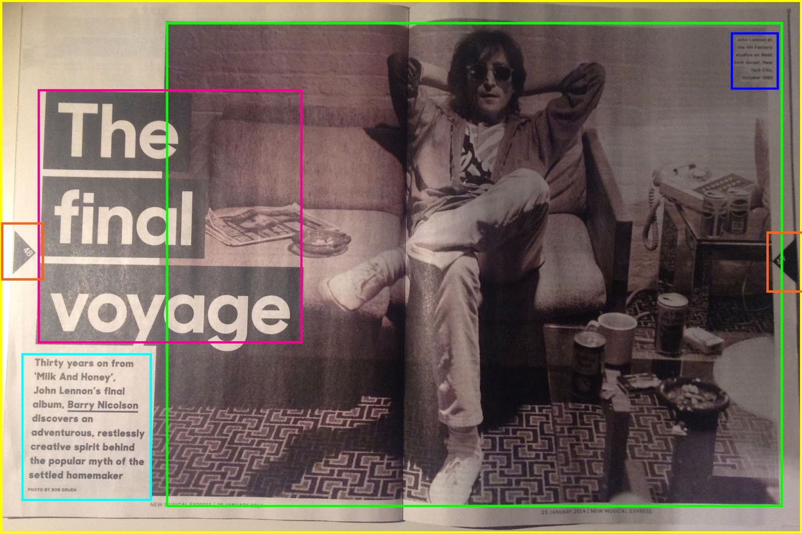
'NME' Music Magazine - Third Double Page Spread Analysis
On the first page of the of the double page spread there is only one image and that is of John Lennon when he was younger; this is shown through the de-saturated image which makes it look much older and from that time. Furthermore, in the top right hand corner of the image which is highlighted by the blue rectangle is a caption informing us about the image. This is also carried onto the second page of the double page spread which is also highlighted by a blue rectangle. This helps keep the double page spreads consistent.
The design elements that are present are, firstly, the triangles that are used to show the page numbers which are highlighted by orange rectangles and this is also on the other double page spread. Also another design element is the black rectangles that are used to highlight 'The final voyage' on the first double page spread and a quote on the second page. On the second double page spread yellow rectangles are used as well. These simple elements bring much more substance to the page and it just makes the double page spread more interesting.
On the second double page spread several more images are used which are highlighted by a green rectangle and there are 4 in total. These images help to inform the reader more about the article and give them a more visual experience, rather than just boring text. Moreover, the image nearest to the right hand side is at an obscure angle, so although the image is small our attention is still drawn to it as it is different from what we usually see in a music magazine.
There are six columns that are used on this double page spread and they are all evenly spaced apart. There is a lot of text on the second half of the double page spread and I think this is to make up for the lack of text that is presented on the first page of the double page spread which is highlighted by a turquoise rectangle. An interesting element of the text is shown in the right hand corner where the text is highlighted yellow. This works well as, firstly, it draws your attention to it but also it stays within the house style as the main colours that are being used are white, black and yellow.

Lastly, a common design element is used at the beginning of the text which is the drop caps. This is bold, in sans-serif font and it is black. This just adds something extra to the text and simply makes it more appealing to the eye.
'Kerrang' Music Magazine - Second Double Page Spread Analysis
My second double page spread analysis is on an Of Mice & Men article.
There are several images on this double page spread - 9 in total. The main image is of the band in a staged photograph outside on some stairs; I think suits their characters and goes with the genre as well as it is something quite different. Again it is the typical group photograph with the main lead in the foreground and the other members of the band in the background. This image takes up most of the first page with the text written around it and it slightly laps over onto the next page. The other images are simply placed around the double page spread helping the reader to engage more with the article that has been written.
There are several design elements that are used on this double page spread, they are all fairly simple such as the sticker that is in the left top hand corner that is highlighted with the red rectangle. This works really well as firstly it it stays within in the colour scheme through the use of red, white and black. Also through the use of this design element, the chosen colours and fonts, it makes the page more appealing to it's audience. Furthermore, other design elements that are used are the yellow rectangles that help to highlight particular parts of the text.
Many coloumns are used on this double page spread. On the first side they use 4 columns, the first column being much bigger than the other 3. On the second side of the double page spread 5 columns are used. It is not usual for this many columns to be used on one double page spread. However, it does make everything look very organised and it compliments the number of images that are used.
There is the page number and the brand identity feature used on both sides of the double page spread - on the first page it is in the bottom left hand corner and on the second page it is in the bottom right hand corner. This is highly common for a music magazine to have. Moreover, within magazines that are published monthly rather than weekly it is quite usual to see an issue number to be published there as well to increase the identity aspect of the magazine.
'Q' Music Magazine - First Double Page Spread Analysis
In the top left hand corner of the image a design element of a simple pink rectangle is used which highlights a caption that introduces all of the people in the band, what year it is and where they are. This keeps to the house style of the double page spread and as you can see this design element is carried over onto the second page of the double page spread which you can see highlighted in blue in the right top hand corner of the image.
Furthermore, the image on the second page also takes up the whole double page spread but again it is partly covered by the text that is written on it. This is the same as the first image used. However, this image is in black and white which connotes that the band is old, which they are, therefore helping the reader to link this connection more easily. Also it is the only image on this double page spread but it still works very well as it is of a live performance which gives a greater impact on the page as a whole.
Another design element that is used is another simple blue rectangle in the top right hand corner of the image and this also helps maintain the house style throughout the article. A smaller and more refined version of what is shown on the first double page spread is used which is highlighted by a green rectangle; also the same font and colour scheme of the font is used in both blue rectangles.
 Moreover, the title on the second double page spread is 'The Holy Alliance'. This is written in large, bold, sans -serif text and it is underlined with a think pink line. Also this is carried through to the beginning of the text which starts with 'In the'.
 Lastly, the 'Q' magazine uses different layouts for different articles. As you can see shown on the first page of the double page spread the text is presented in a block of text and no columns are present at all. Where as in this double page spread they use three columns for their text which is highlighted by the turquoise rectangle.
Front Page Construction
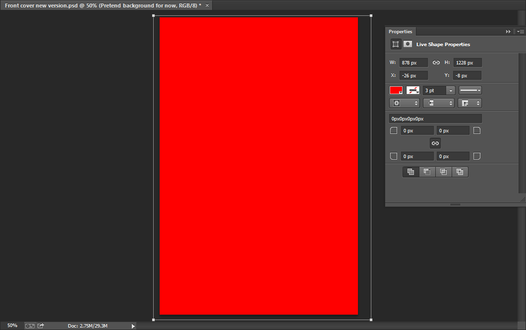
I began with a plain red background when I started to create my music magazine front cover.
After this, I decided to make a sticker to go at the top of the page on the right hand side of the banner. I went on the internet and found this image that you can see on the left and cut it out using the magnetic lasso tool.
I then placed it in the top right hand corner and I then changed the colour of the sticker from red to black. As you can see more clearly in the image below, I did this by going to image - adjustments - replace colour.
Next, I decided to change the background colour of my front page as I thought the previous red that I used was a little too bright and this colour looks more professional. I simply did this by using the rectangle tool to change the background colour.
 I chose a font from DaFont for the masthead for my contents page and as you can see I chose the font 'Bison'. I chose this as I thought it suited my genre well and it went well with the actual name 'Eccentric'.
Once writing the masthead I decided that it would look good if I added a drop shadow. I kept the opacity at 100% and underneath you can see more clearly as to how I created the drop shadow.
 I then added the text in the sticker which reads 'My Life, Special Offer!' Furthermore, I wrote 'Imagine Dragons','Arctic Monkeys' and 'Harry Gold' in the top banner and to these words I added a slight outer glow to enable them to stand out. The opacity of the outer glow I used is 75%, the range is 50%, the spread is 5% and the size is 5%, as you can see below. After this I added another yellow banner but this time at the bottom of the front page and a bit bigger.
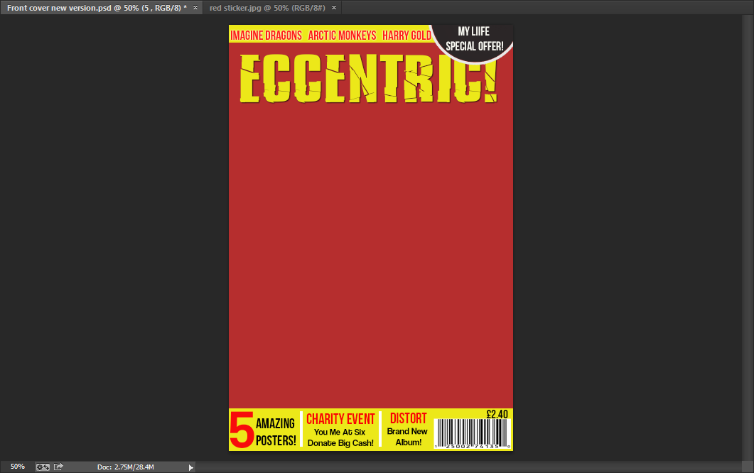
After this, I added text in the bottom banner using the horizontal type tool. The fonts I used were Bebas Neue and Coolvetica. As you can see I simply divided the text up with small white rectangles which I made with the rectangle tool. Lastly, I then found an image of a bar-code and put that in the right hand corner after adjusting the size.
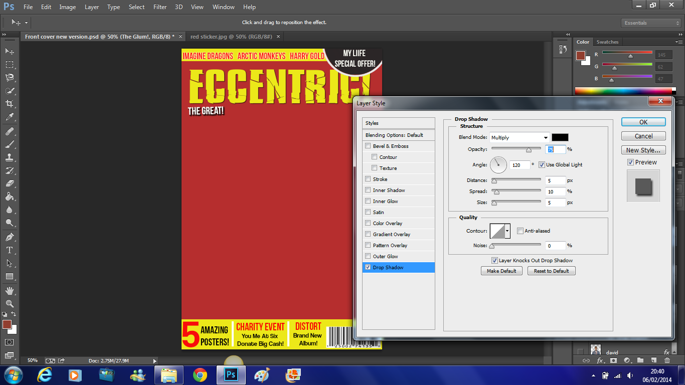
As you can see,of the first of the trio which is 'The Great!' I added a drop shadow to and below you can see more clearly that the opacity is 75%, the distance is 5%, the spread is 10%, the size is 5% and the angle used is 120 degrees.
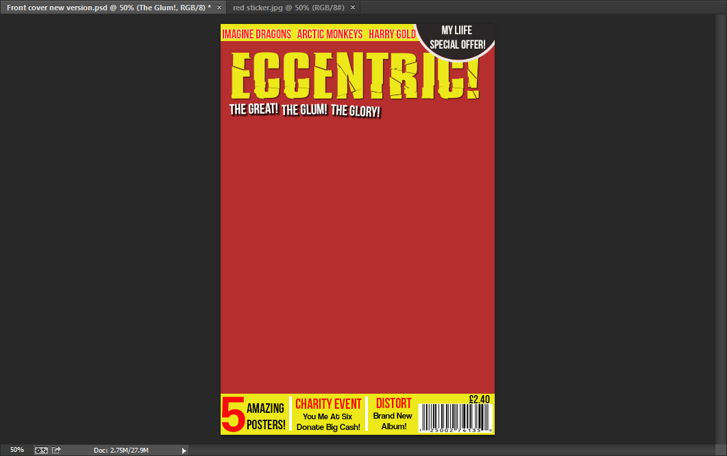 Here is the completed alliteration of the 'The Great!The Glum! The Glory!'. This trio has exactly the same drop shadow as 'The Great!' which is shown above.
Here is my first main cover line - 'David Field Exclusive Interview'. This is written in Bebas Neue font in yellow.
I then added individual black rectangles using the rectangle tool. I placed these underneath the text as this enabled it to stand out more and this is very important as this is the most important cover line on the front page.
I then did this for all of the other cover lines on the front page. Except here the text is in black instead of yellow. Moreover, the main heading which in this case is 'Pearl Jam' has a yellow rectangle fitted around it and the text underneath has white rectangles fitted around them which are all created individually.
Next I focused on my main image. I began by cutting him out using the magnetic lasso tool. I dragged him onto my front page and altered the size of him. I placed him behind the cover lines but in front of the masthead, as this is a common feature used by professional music magazines.
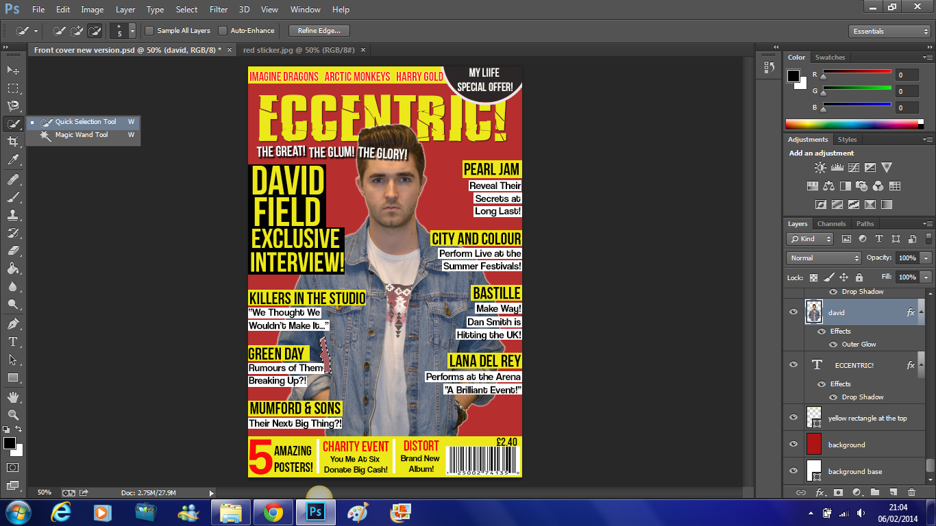
After this I noticed that the colour underneath his arm was not the same as the background so I selected the area using the quick selection tool and as I did earlier to change the colour of the sticker I went to image - adjustments - replace colour. Which you can see below.
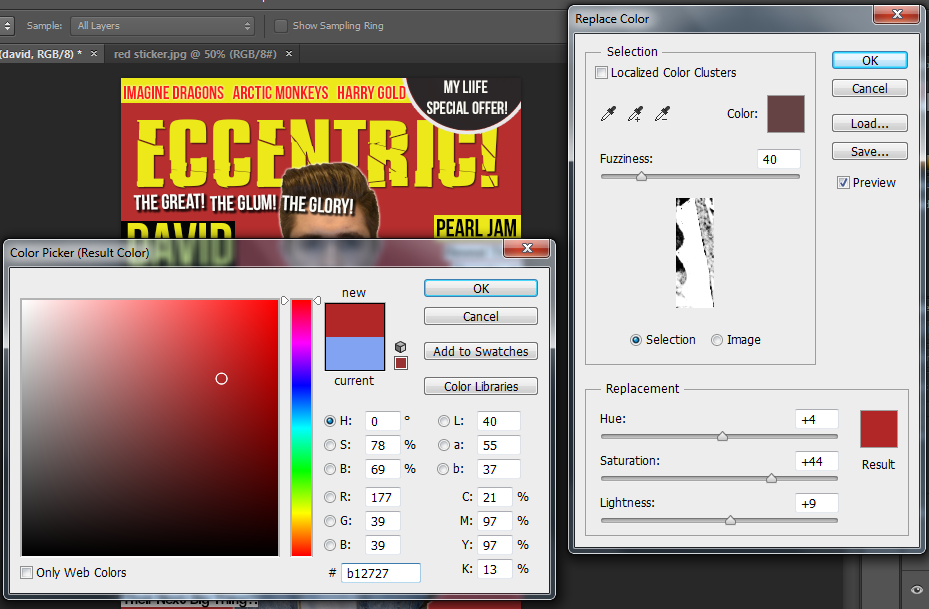 Here you can see the exact colour that I used to match the colour to the background.
I noticed that David had slight red eye, so I simply used the red eye tool and clicked on either eye to correct this.
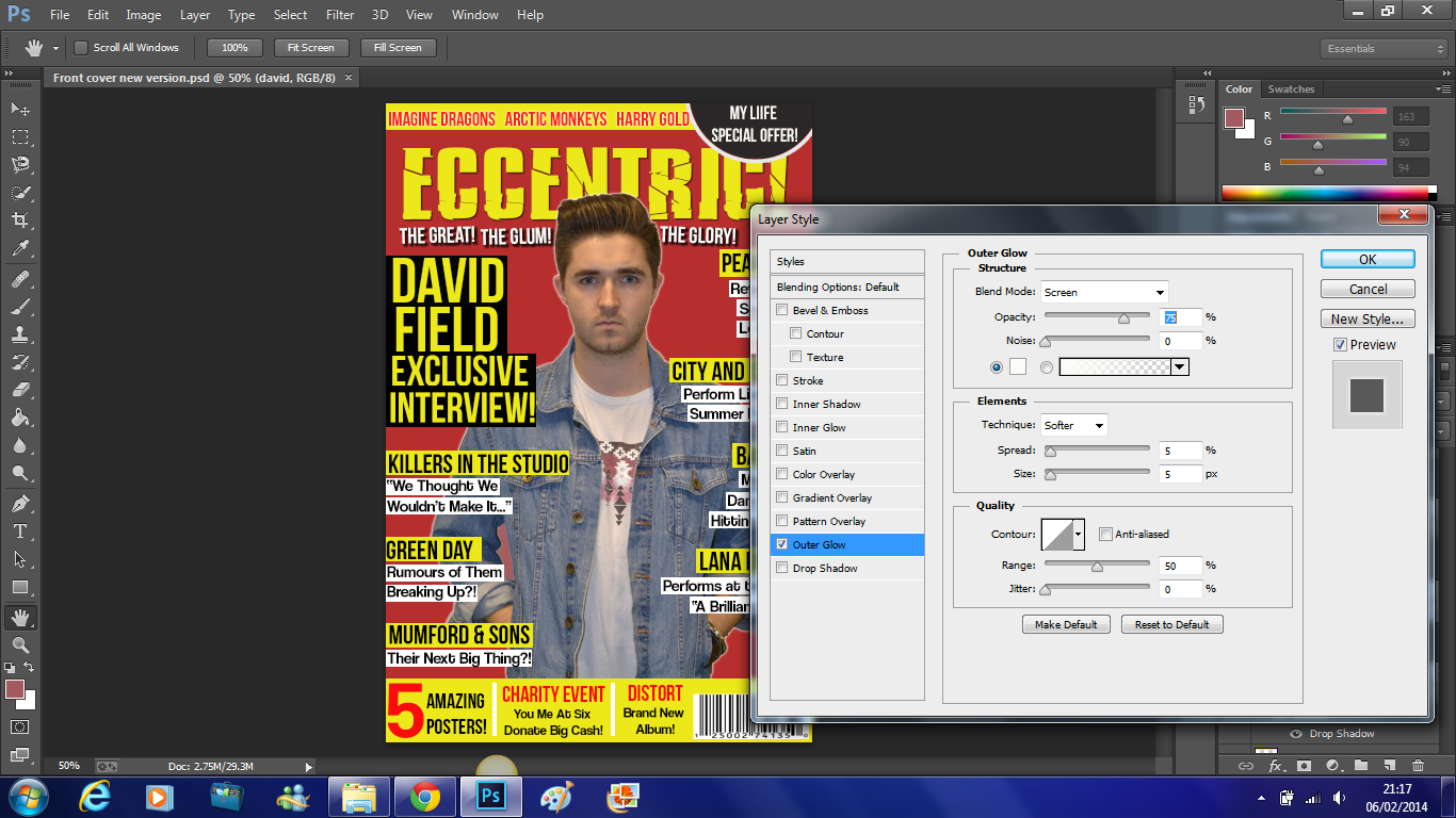 Lastly, I wanted to add a slight outer glow to David to make him stand out more and become more eye catching to the reader. Here you can see that the opacity of the outer glow is 75%, the spread is 5%, the size of the outer glow is also 5% and the range used is 50%.
This is the finished front page which you can see on the right.
Subscribe to:
Comments (Atom)


