
The Masthead/Title
The masthead/title of the magazine that I am analysing is
‘Kerrang’. ‘Kerrang’ is a UK based magazine devoted to rock music, it is named
after the onomatopoeic word
that derives from the sound made when playing a power
chord on a distorted electric guitar, Kerrang! The title connotes that the magazine is to do with music,
such as, British heavy metal and
also it is about the rise of hard
rock acts. The actual word is a bold yellow
colour which contrasts well with its background which is red. On the issue
Brendon Urie's (who is modelling for the main image) head is in front of the
letter 'A' of the word 'Kerrang' and also the letter 'G' is partly covered,
this design is common among all magazines due to the name still being
recognisable despite its lack of full visibility.

The Headline
The headline features
one of the main articles in the magazine 'Panic at the Disco'. The style of
the font is sans- serif, it is very bold and it is written in caps lock so it comes
across as very loud and it stands out. 'Panic at the Disco' is written in
yellow and it's accentuated by the black background also
the colours keep to the house style which is mainly yellow, black and red, so
this meets that criteria perfectly as the background the headline is
on is red. Moreover, this will enable the reader to gather more of an idea as
to whether the contents of the magazine appeals to them and gives them an idea
as to what will be in the magazine.
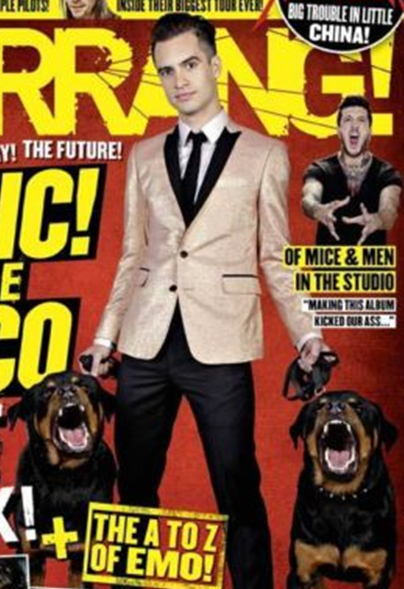
The Main Image
The main image is of the attractive Brendon Urie dressed in a
suit holding a lead of a Rottweiler dog in each hand; the dogs are in mid
bark and look quite vicious. The man’s facial
expression is very serious and he has confident
body language where his legs are slightly apart and his lower body
is more forward. He is directly looking at the camera. The ideal reader that is
identified with this main image would be someone who has a good sense of style, quite outrageous in their personality, bold, and smart and well-dressed yet has a scarier side to
them as well.
The Strapline
The strapline is
the yellow strip at the top of the page that tells you further what is going to
be in the magazine further in this case it is about ‘Linkin Park’ and ‘Alter
Bridge’ this is written in sans-serif font and it is written in red this
time with a yellow background and underneath it is some more writing in black
which gives it more detail.
The Cover Lines


The Connotations of Typefaces, Graphics, Colours and the Language Used
Design Elements
The whole front of the magazine is very bold, and it is a mixture of serif and sans-serif fonts but mainly sans-
serif. The main colours used are red, yellow, white and black. The title
‘Kerrang’ has a completely unique font
from everything else. Some of the words go over the main image making a nice frame around it, and some of the words have
a shadowing effect on them which makes them look
bolder and again contrast against the red background.
Language Used
The main language feature that
is used on this front cover is the use of alliteration which
is the occurrence of the same letter or sound at the beginning of adjacent or
closely connect words; they also use quite a lot of exclamation marks. There is a mixture of numbers and
words also.
The cover
says to its reader that I am bold, confident, quirky, sometimes a bit scary, and not afraid to stand out and
into emo side of things and obviously that genre of music.
What Makes the 'Kerrang' Magazine Unique?
I think this magazine has a unique style as there are other music
magazines such as 'Q' but that has a completely different layout and has not
got as much content on the front page. What makes this unique is that all the writing is in capitals so it is saying that everything
is important and that it is the best magazine to read. There is a range of font
sizes and yet everything is in its own spotlight.
Inside the Magazine 'Kerrang' and General Information
Inside
How many pages are there and how
many pages of adverts are there?
There are 63 pages in this magazine,
the number of adverts that
it contains is about 25. The things that are advertised vary
from films, albums, ticket for concerts, joining up to ‘Kerrang’ on social
networking sites, signing up to more of their magazines, posters,
music bands/ artist, fashion items, and memberships.
How many double page spreads are
there?
 There is a double
page spread about ‘Of Mice
and Men’ releasing their new album, there is one about the ‘Chinese democracy’
when Metallica arrived in China for their first ever show in the world’s most
popular country. There is another double page spread about ‘Pearl Jam’ releasing their 10th album
– Lightning Bolt. There’s another one about ‘Feedback’. There is double
page spread about ‘Panic!
At the disco’.
There is a double
page spread about ‘Of Mice
and Men’ releasing their new album, there is one about the ‘Chinese democracy’
when Metallica arrived in China for their first ever show in the world’s most
popular country. There is another double page spread about ‘Pearl Jam’ releasing their 10th album
– Lightning Bolt. There’s another one about ‘Feedback’. There is double
page spread about ‘Panic!
At the disco’.
Are there any “advertorials”?
There are several advertorials where there is a mixture of both an article and an advert on the same page and it is quite
difficult to tell the difference, however, there is one in particular that does
have an article on it about a group called ‘serial killers’ but also there are
several adverts around the page as well and if you aren’t reading the article
closely it’s easily overlooked as an advert.
What is this magazines house
style and why is it appropriate for the target audience?
The magazines house
style is that ‘Kerrang’
always has a big picture usually going over the masthead or just below it; the titles are
usually very big, in capitals and mainly sans-serif. There are lots of columns and other bits of information in
separate boxes so it fills out the page and there is a lot to attract the
reader’s eye. This layout, which includes: bold font, text, and bright colours is all very
appropriate for the target audience as it is aimed at teenagers to young
adults that are into their emo music magazines, and this magazine is very appealing to that type of person .
General
Which company produces the
magazine?
Here in the United Kingdom the
magazine is published by Bauer Consumer Media and has become the world's biggest
selling weekly rock magazine.
What is the target audience?
The magazine appeals to a specific niche audience because it concerns topics and themes
that are relevant to people who listen to and are interested by rock music and
its background. 'Kerrang' identifies its audience as 'individually minded, independent of thought and musically
experienced, an audience defined by attitude, passion and loyalty'. This
devoted audience of rock fans is made up of 60% males and 40% females with
'Kerrang's' demographic fall into social class D-C. The predominate
ethnicity of the
readership is white British with a target population of 16-24 year olds.
How much does it cost and how often is it published?
'Kerrang' magazine comes out
every week, on Wednesdays. It costs £2.20 every week but on Christmas editions
it can cost a little more and the magazine usually stays in the shops until
Friday.
What is its circulation?
The latest statistics recorded from ABC's broadcast
circulation systems shows
that since the 25th of July 2012 the total
circulation of the
magazine is 42,077. The high number of circulation which 'Kerrang' has is evident that
the magazine is successful and has a good understanding of its audience and
what makes them want to buy their magazine.
What data is available about it on the NRS website?
The data that is available on the NRS website about 'Kerrang' is as follows:
Frequency: Weekly
Print: 813
Web: 90
Total: 903
Approximate monthly revenue streams from advertising and circulation:
Statistics show that the overall
income of monthly revenue streams purely from advertising totals to £472,637 this may vary from
time to time depending on the year, either when people have more money or if
the actual issue is
bigger, has more content or is a special edition and this will affect the price as well.
No comments:
Post a Comment